Translating Infographics: Best Practices for Maximum Impact Across Cultures
Discover best practices for translating infographics across cultures. Learn how to maximize impact, avoid pitfalls, and leverage AI tools for effective visual communication.

Contributors

Subscribe to our newsletter
As a product marketer at Translate.photo, I've seen firsthand how crucial it is to effectively translate infographics for global audiences. It's not just about swapping out words - it's about conveying complex ideas visually across cultural boundaries. Let me take you on a journey through the fascinating world of infographic translation!
The concept of infographics dates back centuries, with early examples including ancient Egyptian hieroglyphics and Leonardo da Vinci's detailed anatomical drawings. But it wasn't until the digital age that infographics truly exploded in popularity. Now, they're everywhere - from social media to annual reports. And as our world becomes increasingly interconnected, the need to translate these visual communication tools has skyrocketed.
I remember the first time I tackled translating a complex infographic for a global marketing campaign. It was a real eye-opener! I quickly realized that a straight text translation wouldn't cut it. The layout, colors, icons - everything needed careful consideration to ensure the message resonated with each target audience. It was like solving a visual puzzle, making sure each piece fit perfectly no matter the language or culture. That experience sparked my passion for mastering the art and science of infographic translation.
Translating Infographics: More Than Just Words
When it comes to translating infographics, you can't just focus on the text. Oh no, my friend - it's a whole different ball game! You've got to consider the entire visual package. Let's break it down:
- Text translation: This is your starting point, but it's just the tip of the iceberg.
- Layout adjustments: Different languages take up different amounts of space. You might need to get creative with your design.
- Cultural symbols: What works in one culture might be confusing or even offensive in another.
- Color psychology: Colors can have vastly different meanings across cultures. Choose wisely!
- Data visualization: Some chart types might be more familiar to certain audiences.
The Challenges of Infographic Translation
Boy, oh boy, translating infographics isn't for the faint of heart! You'll face some unique hurdles:
- Space constraints: German tends to be longer than English, while Chinese is often more compact. How do you make it all fit?
- Directional changes: For languages read right-to-left, you might need to flip your entire design.
- Numeric formats: Date formats, decimal points, and even large number groupings can vary.
- Idiomatic expressions: Those clever puns might fall flat in translation.
- Font compatibility: Not all fonts support every language's character set.
Best Practices for Translating Infographics
Now that we've covered the challenges, let's dive into some tried-and-true best practices. Trust me, these tips will save you a lot of headaches!
1. Start with a Flexible Design
When creating your original infographic, think ahead. Design with translation in mind:
- Use plenty of white space
- Create modular elements that can be easily rearranged
- Choose fonts with broad language support
- Avoid text embedded in images
2. Prioritize Clarity Over Cleverness
I know, I know - you want your infographic to be witty and memorable. But when it comes to translation, clarity should be your North Star:
- Use simple, straightforward language
- Avoid idioms and culture-specific references
- Opt for universal symbols and icons when possible
3. Work with Professional Translators
This is where tools like Translate.photo really shine. Don't rely on machine translation alone - you need human expertise to capture nuance and context:
- Brief your translators on the purpose and target audience of the infographic
- Provide context for any industry-specific terms
- Be open to their suggestions for culturally appropriate alternatives
4. Adapt Data Visualization
Different cultures may interpret data visualizations differently. Consider these adaptations:
- Use bar charts instead of pie charts for audiences less familiar with the latter
- Adjust color schemes to align with cultural associations
- Ensure units of measurement are appropriate for each target market
5. Localize Design Elements
It's not just about the words - the visuals need to resonate too:
- Replace photos with locally relevant images
- Adapt icons to reflect familiar objects or concepts
- Consider cultural color associations (e.g., red for luck in China, but danger in Western cultures)
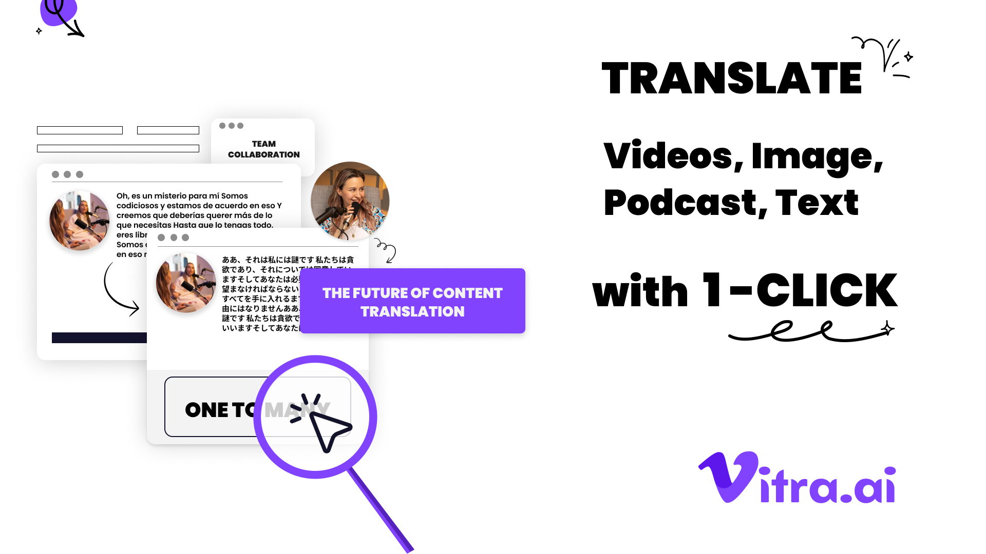
The Power of AI in Infographic Translation
Now, I can't talk about translating infographics without gushing about how AI is revolutionizing the process. Tools like Translate.photo are game-changers:
- Speed: Translate entire documents in seconds
- Consistency: Maintain brand voice across languages
- Integration: Work directly within design software like Photoshop and Illustrator
- Context awareness: AI understands the bigger picture, not just word-for-word translation
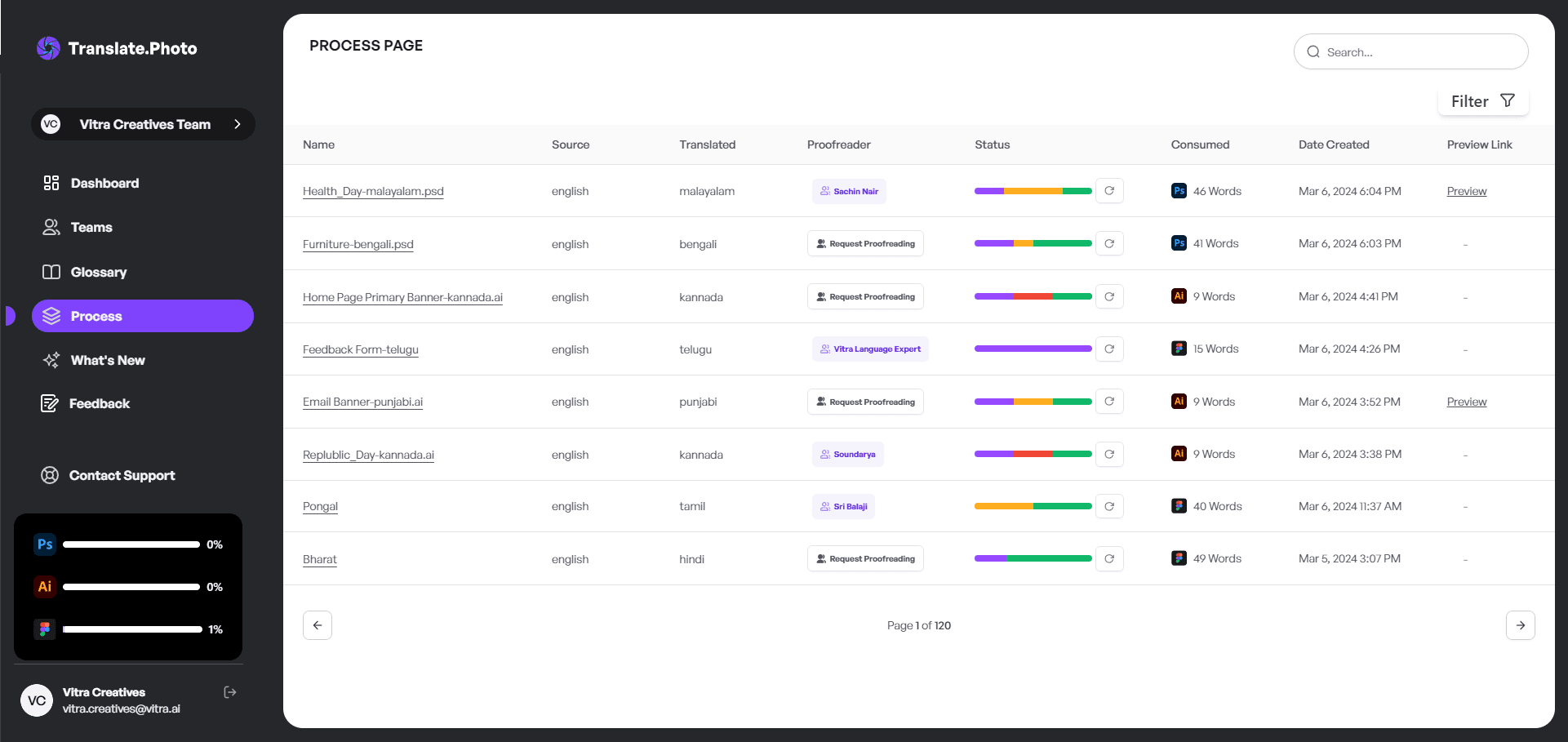
How Translate.photo Streamlines the Process
Let me walk you through how Translate.photo makes infographic translation a breeze:
- Open your infographic in Photoshop or Illustrator
- Launch the Translate.photo plugin
- Select your source and target languages
- Click "Translate Document"
- Review and refine the AI-generated translation
- Export your localized infographic
It's so simple, it almost feels like magic!
Case Studies: Successful Infographic Translations
Let's look at some real-world examples of infographic translations done right:
Case Study 1: Global Health Campaign
A nonprofit organization needed to translate an infographic on COVID-19 prevention for 20 different countries. Using Translate.photo, they were able to:
- Maintain consistent messaging across all versions
- Adapt hygiene icons to reflect local practices
- Adjust color schemes to avoid cultural faux pas
- Complete the project in 1/10th of the time of traditional methods
Case Study 2: Tech Product Launch
A Silicon Valley startup was launching a new app globally. Their infographic translation process included:
- Localizing app screenshots for each market
- Adapting data visualizations to reflect local user behavior
- Using Translate.photo's glossary feature to ensure consistent tech terminology
- Collaborating with local marketing teams for final approval
Common Pitfalls in Infographic Translation
Even with the best tools, there are some common mistakes to watch out for:
- Overlooking text expansion: Always leave room for languages that take up more space.
- Ignoring cultural context: What's obvious in one culture might be confusing in another.
- Forgetting about text direction: Right-to-left languages might require a complete redesign.
- Neglecting to localize data: Make sure statistics and examples are relevant to each market.
- Relying solely on machine translation: AI is amazing, but human review is still crucial.
How to Avoid These Mistakes
Here's a quick checklist to keep you on track:
- Design with 20-30% extra space for text expansion
- Consult with local experts for cultural insights
- Create mirrored layouts for right-to-left languages
- Research local data and examples for each market
- Use AI translation as a starting point, not the final product
The Future of Infographic Translation
Buckle up, because the future of infographic translation is looking bright! Here are some trends I'm excited about:
- Real-time collaboration: Designers and translators working simultaneously on projects
- AI-powered layout adjustment: Automatically reflow designs based on translated text
- Augmented reality integration: Translate infographics in real-time through AR apps
- Personalized localization: Adapt infographics based on individual user data and preferences
- Voice-enabled infographics: Combine visual and audio elements for accessibility
Preparing for the Future
To stay ahead of the curve:
- Invest in flexible, modular design practices
- Embrace AI tools like Translate.photo
- Build a diverse, global network of collaborators
- Stay curious about emerging technologies and cultural trends
Measuring the Impact of Translated Infographics
You've put in the work to create amazing translated infographics - but how do you know if they're effective? Here are some key metrics to track:
- Engagement rates: Compare how long users interact with different language versions
- Social shares: Which translations are getting the most traction on social media?
- Conversion rates: Are users taking desired actions after viewing the infographic?
- Feedback and comments: What are users saying about the localized versions?
- Brand perception: Has awareness and sentiment improved in target markets?
Tools for Tracking Success
Consider using:
- Google Analytics for website engagement metrics
- Social media analytics platforms for share and engagement data
- Surveys and focus groups for qualitative feedback
- Brand tracking studies to measure long-term impact
Translating Infographics: Best Practices for Maximum Impact Across Cultures
To wrap things up, let's revisit the key takeaways for creating infographics that truly resonate across cultures:
- Design with translation in mind from the start
- Prioritize clarity and cultural relevance over clever wordplay
- Leverage AI tools like Translate.photo for efficiency and consistency
- Adapt visual elements, not just text
- Collaborate with local experts for authentic localization
- Measure and iterate based on performance data
By following these best practices, you'll create infographics that not only look great but also effectively communicate your message to diverse global audiences. And with tools like Translate.photo in your arsenal, you'll be able to do it faster and more accurately than ever before.
So, are you ready to take your infographics global? The world is waiting for your visual stories - let's make sure they're understood and appreciated everywhere!
Conclusion:
As we wrap up our deep dive into translating infographics for maximum impact across cultures, I can't help but feel excited about the possibilities. I've seen firsthand how the right approach can transform a simple visual into a powerful, global communication tool. Remember, translating infographics isn't just about changing words - it's about adapting entire concepts to resonate with diverse audiences. By following the best practices we've discussed and leveraging cutting-edge tools like Translate.photo, you're well-equipped to create infographics that truly speak to people around the world. So go ahead, take that leap into global visual storytelling. Your infographics have the power to bridge cultures and make a real impact. I can't wait to see what you'll create!
Our blog
Lastest blog posts
Tool and strategies modern teams need to help their companies grow.

Image optimization
Balancing Image Quality and Load Speed for Portfolio Links
Learn how to balance high image quality and fast load speed for portfolio websites using smart compression, responsive images, and performance optimization techniques.


Image-optimization
How to Change Image Dimensions Without 'Squishing' Your Subject
Learn how to change image dimensions without distorting your subject by using proportional scaling, smart cropping, and canvas expansion techniques.

Image translation
How to Translate JPEG Images
Learn how to translate JPEG images accurately while preserving layout, brand tone, and design quality with a smarter AI-powered workflow.
Join Our Satisfied Clientele
- Global Reach, Local Impact
- Efficiency Redefined
- Optimized SEO, Elevated Traffic